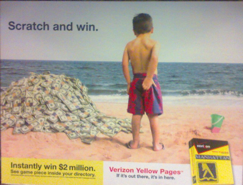
 1. The Verizon phone book sweepstakes is being advertised. The little boy "scratching" his bottom on the beach represents the scratching of the ticket in the sweepstakes.
2. (Text at top- "Scratch and win") Posture- The text is oblique.
Weight- The text is mildly heavy, falling in the bold to extra bold range.
Width- The width of the text is normal.
Thick/Thin Contrast- The text has no contrast.
3. The text in this ad is meant to make you laugh. As for effectiveness besides that, I think the text does not do a good job. The wording is quite bland and the placement of the text is ineffective.
Ad 2.
 1. The handbag the model is holding is the product being advertised. The goal of the model is to be as attractive as possible and lure people into buying the item thinking they will also become attractive with the purse.
2. ("Guess" Text) Weight- This text seems to fall in the range of normal to light weight.
Width- The width of the text looks to be expanded width.
Serifs- The text serif seems to either be unbracketed or squared.
Thick/Thin Contrast- There is no contrast.
3. The text is effective because it is flashy. The gold coloring contrasts well with the white dress, grabbing your attention.
Ad 3.
 1. The service of the USPS is being sold here. The postal service is saying they are more reliable, can be trusted, and will deliver your mail faster then anybody. The ad uses the pictures of USPS shipping products to draw the attention of the viewer. The ad also has the website of the company, encouraging viewers to go to it.
2. (Text At Top of Ad) Thick/Thin Contrast- There is no contrast in the letters. No letter seems to have a thicker or thinner side.
Serifs- No letter above has any sort of embellishment.
Weight- On the sheet given to us, the letters would fall into bold/ extra bold range.
Width- the letters all seem to be the same width, and on the sheet, the letters would fall into the normal to expanded width category.
3. The letters at the top grab your attention right away because they are bold and all uppercase. If I were looking at the ad, the text at the top would grab my attention first, and that is the goal of the add.

No comments:
Post a Comment